Where to Place Neon Signs in Retail Stores to Grab Customers Attention
Your shop looks great. Your products are solid. But people keep walking straight past the door. Sound familiar?
Placement beats brightness every time. The right spot for a neon sign in retail depends on where your customer stands when they decide to walk in, not on what looks nice on a mood board.
Mount it at eye level, think about Australia’s northern sun glare, match letter size to viewing distance, keep the background simple, and check landlord or council rules before you drill a single hole.
We built our custom neon range because we kept seeing the same problem over and over. Beautiful stores with beautiful signs that nobody outside could actually read.
The sign was there. The glow was there. But the placement was an afterthought, and that’s where the money got left on the table.
Table of Contents
ToggleKey Takeaways
- Your sign should work for the spot where customers decide to walk in, not just match your wall.
- Beat Australian glare by planning for north facing sun and choosing bold colours like red or warm white for window signs.
- Sign size depends on viewing distance and mounting height, not how much wall space you have free.
- Landlords, shopping centres and councils can limit your sign’s size, weight and even colour.
Is Your Sign Actually Visible From Where Customers Decide to Walk In?
Here’s the part most retailers get wrong. They design signage for the inside of the store, not for the person standing on the footpath deciding whether to come in. That’s backwards thinking.
The “decision point” is the spot where a passerby either commits to entering or keeps walking. For most busy streets, that’s about 2 to 4 metres out from your door. Your sign needs to work from there, not from directly underneath it.
The Sightline Test Nobody Bothers Doing
Stand outside your own shop. Walk across the footpath from both directions, then look at your sign from the curb.
A lot of window sign problems happen because the layout was designed for someone already standing inside, not someone walking past.
If you can’t read your own sign from 3 metres away in both directions, your customers won’t be able to either.
Mounting Height and Letter Size, The Pair That Actually Matters
Bigger isn’t automatically better. It comes down to ratio.
Hang signs at normal eye level, roughly 1.5 to 1.7 metres from the ground. Only go bigger and higher if most of your customers are driving past rather than walking.
Letter height needs to match how far away people usually stand, not how much wall space you happen to have.
Background Contrast and Clutter Kill More Signs
A sign can be the right size and still fail if it’s fighting a busy background. Brick patterns, messy window displays, or posters stuck behind the sign all slow down how fast someone can read it.
Keep the area around your sign simple so it does the work on its own, without visual noise getting in the way.
At Neon World, we worked with a boutique that had a lovely logo sign mounted right in the centre of its back wall, only visible once a customer was already three steps inside.
We moved the same sign to the window at eye height, in front of a plain wall section instead of a cluttered display. Same sign, same power draw, but people noticing it from outside jumped almost overnight.
The Checklist: Getting Placement Right Before You Order Anything
Before you commit to a wall, window or feature spot, go through this list first.
Check which way the sun comes from. In Australia, harsh sun comes from the north. A north facing window can wash out a sign at midday that looked perfect in your evening test shot.
Test the depth, not just the position. Setting the sign back from the glass by around 20 to 40cm softens reflections while keeping the glow strong enough to see from outside.
Match your colour to the daylight. Reds and warm whites hold up better against bright sun than soft pastels, simply because your window sign is competing with daylight for most of the trading day.
Check your power access before finalising a spot. Outdoor placements need weatherproof cabling and a safe low voltage setup. Indoor feature walls are usually much simpler to wire.
Sort your approvals early. Landlords, shopping centres and local councils all have their own rules around size, weight, and sometimes heritage colour restrictions.
Here’s Where Most Advice Gets It Wrong
The common advice is to put your biggest, brightest sign right above the entrance and call it a day. That advice is lazy, and it ignores how people actually move along a street.
A sign above the door works well for someone already looking up. But most people walking past are looking forward, scanning shopfronts at eye level as they go.
A smaller sign placed right at eye height in the window will often work better than a bigger one mounted high, simply because it sits exactly where people are already looking.
Different Store Zones Need Different Jobs
Not every sign in your store is doing the same job, and that matters more than people think.
Entrance and window signs are your first impression and your decision point sign. They need to tell someone what your shop is in under two seconds.
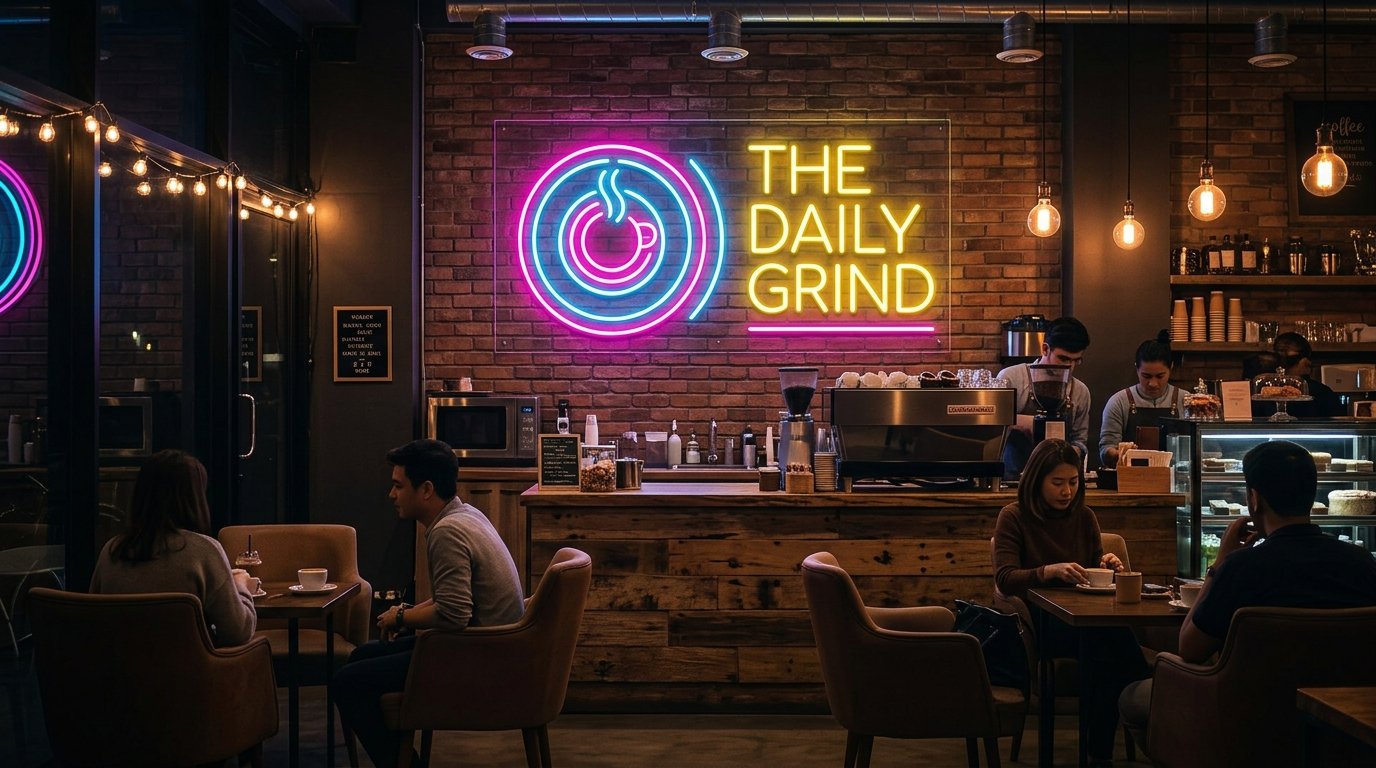
Till wall signs are your brand reinforcement zone. Logo neon signs work well behind a checkout counter because customers look at this spot again and again, and it often ends up in photos taken inside the store.
Feature wall and fitting room signs guide people and create a mood. Short, clear messages work better here, because shoppers need to understand them in a single glance.
Product display signs have a quieter job. They’re not meant to shout. A small neon accent near a shelf simply draws the eye to certain stock without competing with your main entrance sign.
Keep Your Message Short, Wherever It Goes
A window sign only has a couple of seconds to be read by someone walking past. One word, a short phrase, or just your logo works far better than a full sentence.
Save longer messages for feature walls, where people are already standing still and have time to read properly.
Don’t Forget the Photo Moment
Customers love photographing signs. That’s free marketing, but only if you actually plan for it.
A feature wall sign placed somewhere people naturally stand, with enough space and decent lighting around it, turns into free content on social media every single week.
Retail Type Changes Everything About Placement
A fashion boutique, a food outlet, a gift shop and a gaming venue are not solving the same visibility problem.
- Fashion retailers tend to focus on the feature wall and fitting room zone for atmosphere and photo moments.
- Food and hospitality businesses lean harder on the window and entrance for fast readability from a moving crowd.
- Gift shops often do well with a small logo sign near checkout, since browsing customers tend to linger there longer.
- Gaming and entertainment venues usually want bold, high contrast signage mounted a bit higher, since their customers are often looking from further away and at night.
Frequently Asked Questions
1. Can I use the same placement strategy for a pop up store?
Not quite. Pop ups usually need portable, window mounted placements since you often can’t modify walls or drill into leased fixtures.
2. Does neon sign placement affect energy costs?
Yes, slightly. Outdoor placements running longer hours with weatherproof parts usually draw a bit more power than compact indoor feature pieces.
3. Should a neon light sign face the street or face into the store?
Face it toward the street, not the room. A sign designed to be admired from inside your shop does nothing for the person outside deciding whether to walk in.
4. How many neon light signs should one retail store have?
Most stores do best with one strong decision point sign out front and one supporting feature inside, rather than scattering several competing pieces around.
5. Does sign placement need to change with the seasons?
Not the main sign, but smaller directional or promotional neon pieces near entrances or feature walls are often swapped seasonally to keep the space feeling current.
Your First Step
Go stand outside your own shop right now, from both directions, at a normal walking pace, and be honest about what you can and can’t read. If the sign fails that test, it’s not a design problem, it’s a placement problem, and that’s fixable.
Request a shopfront sign recommendation and quote from Neon World and we’ll assess your actual sightlines, sun direction and store zones before recommending a single product.